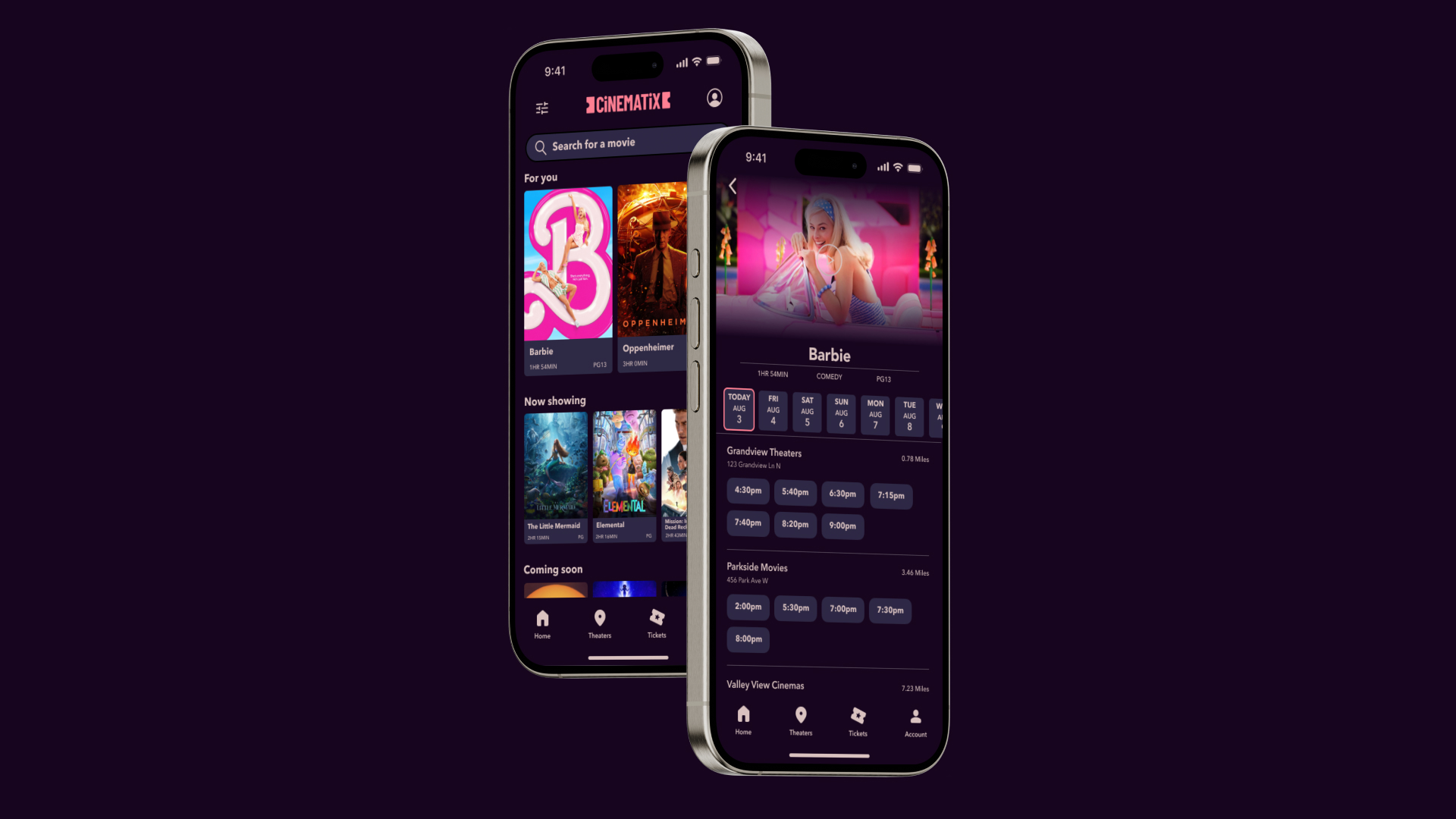
Cinematix
A new cinematic experience unleashed
Overview
Challenge
Design an app for Cinematix that allows users to easily purchase movie theater tickets.
SOLUTION
Create a full design plan for the app keeping the user at the center of it all. Conduct user interviews to see issues with current movie theater ticketing mobile apps. Sketch wireframes and create low-fidelity wireframes. Run usability studies on prototypes and refine design to be more usable. Finally, create high-fidelity prototypes.
ROLE
UX/UI Designer, UX Researcher, Brand Strategist
TIME
8 weeks
TASK
Mobile app and branding
Tools
Figma, Google Docs, Google Slides, Adobe Photoshop
Design Process

EMPATHIZE
Initial Findings
I conducted interviews and created empathy maps to understand the users I’m designing for and their needs.
This user group confirmed initial assumptions movie theater goers being frustrated about a difficult to understand user interface, but research and user interviews also found that users were not having enjoyment in the process of buying movie theater tickets and would like incentives such as rewards programs.
Pain Points
Time
People do not want to spend large amounts of time in the process of buying tickets to movie theaters
No Enjoyment
No incentives besides the end goal of wanting to see a movie are giving people motivation
UI
The user interface is text heavy, has too many distractions, and is difficult to understand
Accessibility
Those with disabilities were disadvantaged at certain parts of the process
Persona
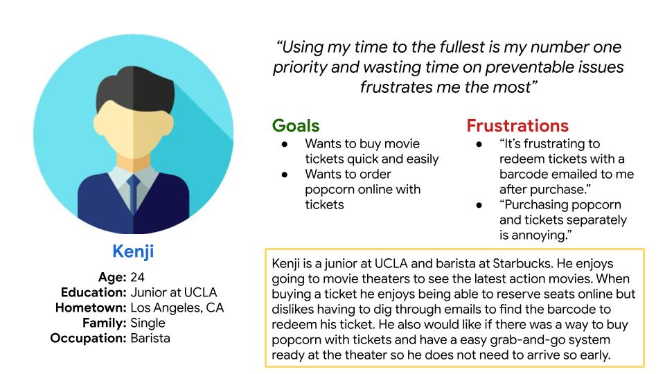
Kenji is a full-time student who needs to buy movie tickets for himself and friends while on the go or at his part-time job, because he does not have time to arrive to the movie theater early to purchase tickets in-person.
DEFINE & IDEATE
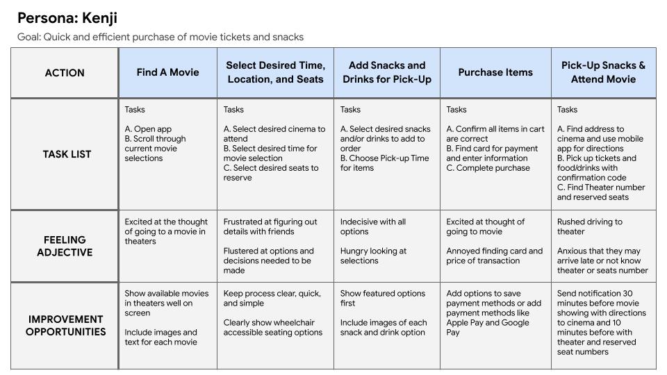
User Journey Map
This journey map for Kenji represents all the tasks and feelings that may occur in the process of purchasing movie tickets.
PROTOTYPE & TEST
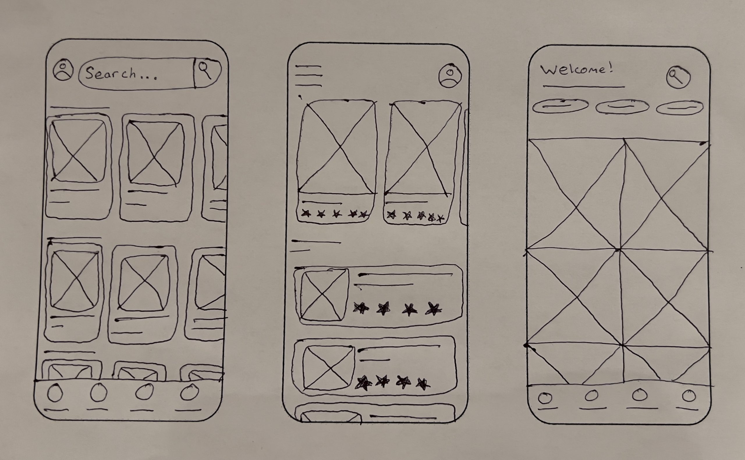
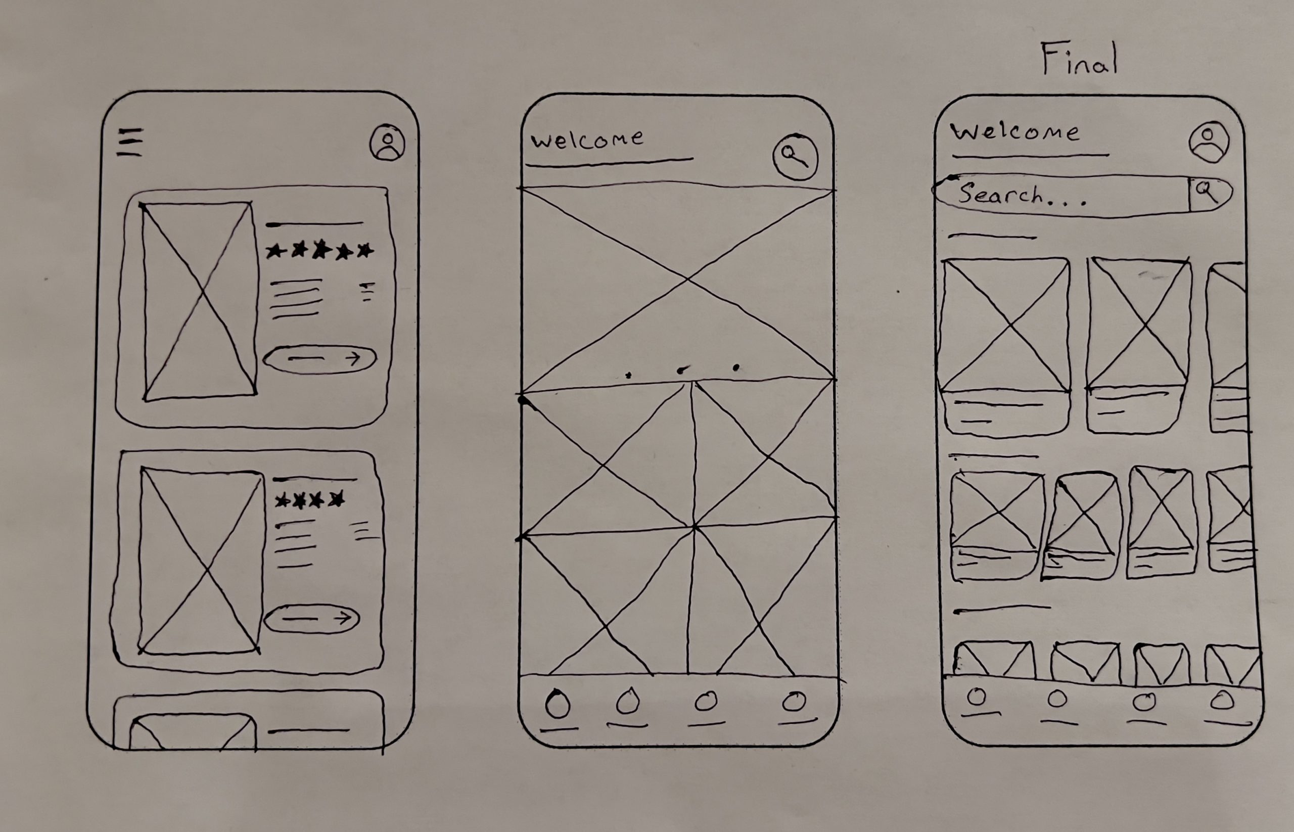
Paper Wireframes
While drawing paper wireframes of the home page layout, it became clear the best option was a full search bar with the welcome, along with a top row of featured movies and the rest of the movies in theaters being below those ones.
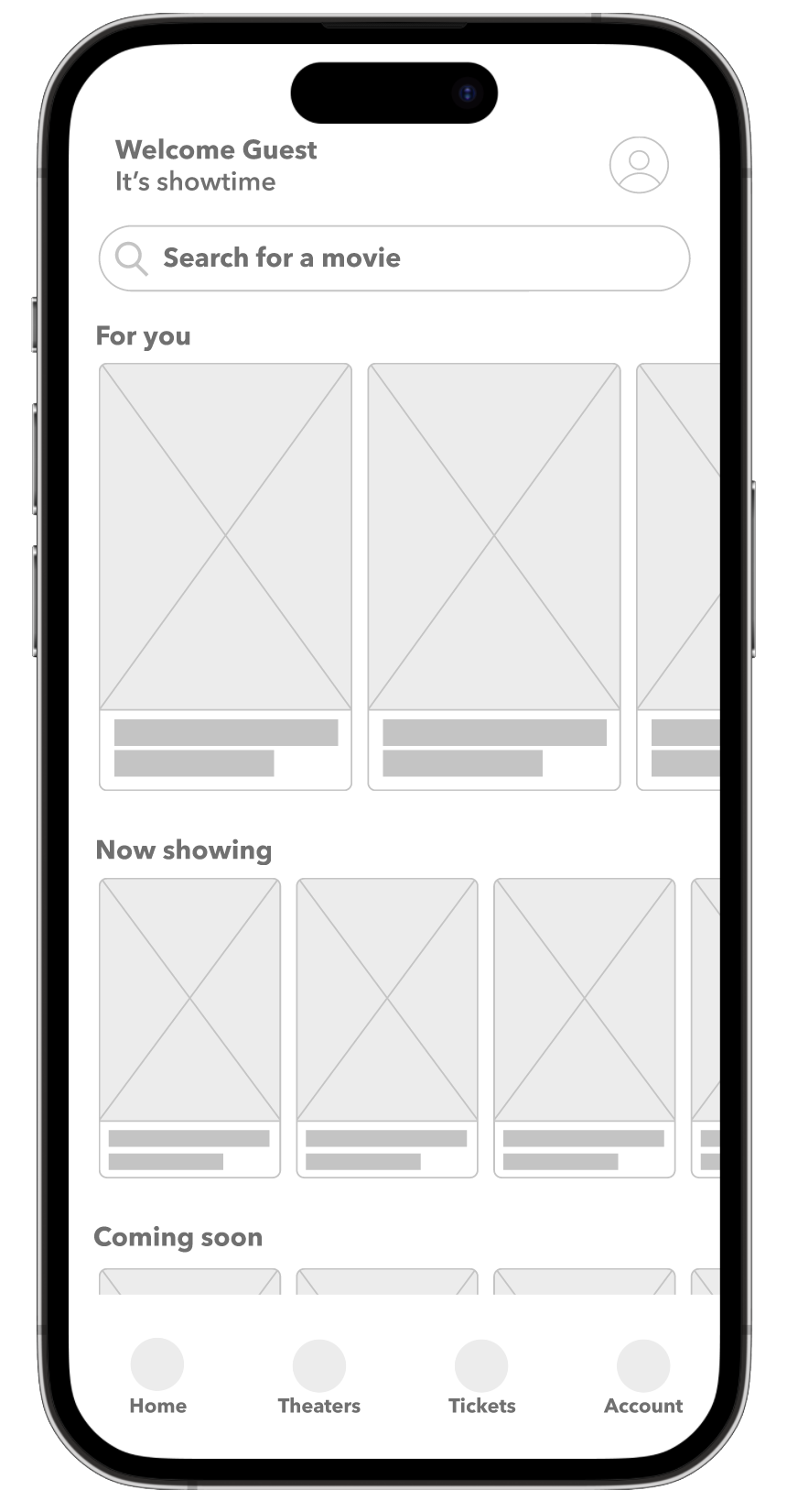
Digital Wireframes
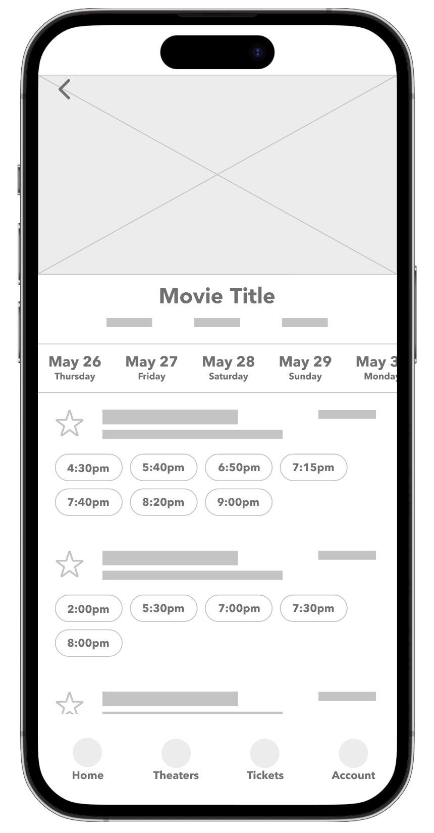
A clean home page set up with all movies clearly listed, a search bar ready to be clicked, a welcome at the top for each user with the company’s tagline, and a clear navigation at the bottom of the screen. For the second page, keeping the process of buying tickets short was the priority, because of this many steps that could be separated were condensed on a single page to keep the flow more user friendly and efficient.
Low-Fidelity Prototype
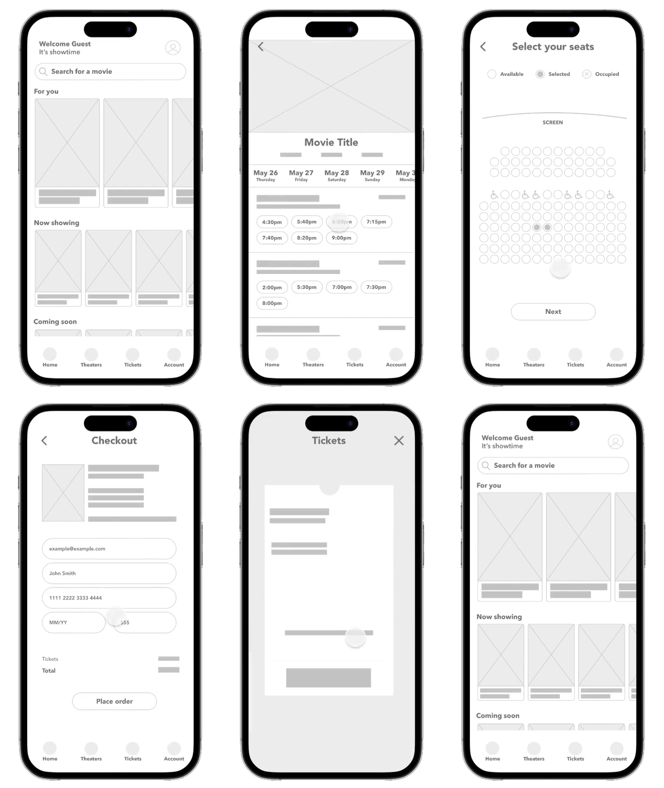
The low-fidelity prototype brings the wireframes to life giving more insight into where the user may scroll and click.
Usability Study
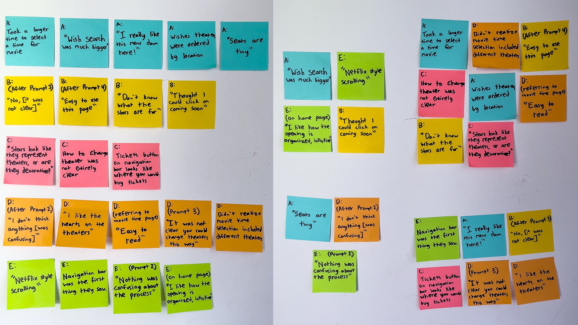
It was discovered that many usability issues came from the time selection page.
Round 1 findings
- Users took long pauses on the time selection page
- The stars on the time selection page were thought as decoration
- Theater selections were not separated and could not be differentiated
Round 2 findings
- Users took the longest amount of time on the time selection page
- When given the option between time selection pages, users preferred the page with all information displayed immediately
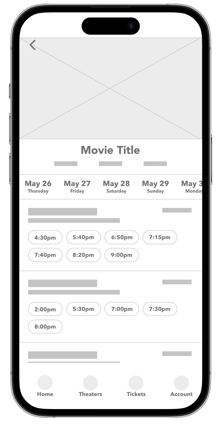
Refining the Design
It was noted that the star was distracting to the user and did not give the message that it was an option to “favorite” a certain theater. To keep the design clear and concise it was removed.
Before

After
Name
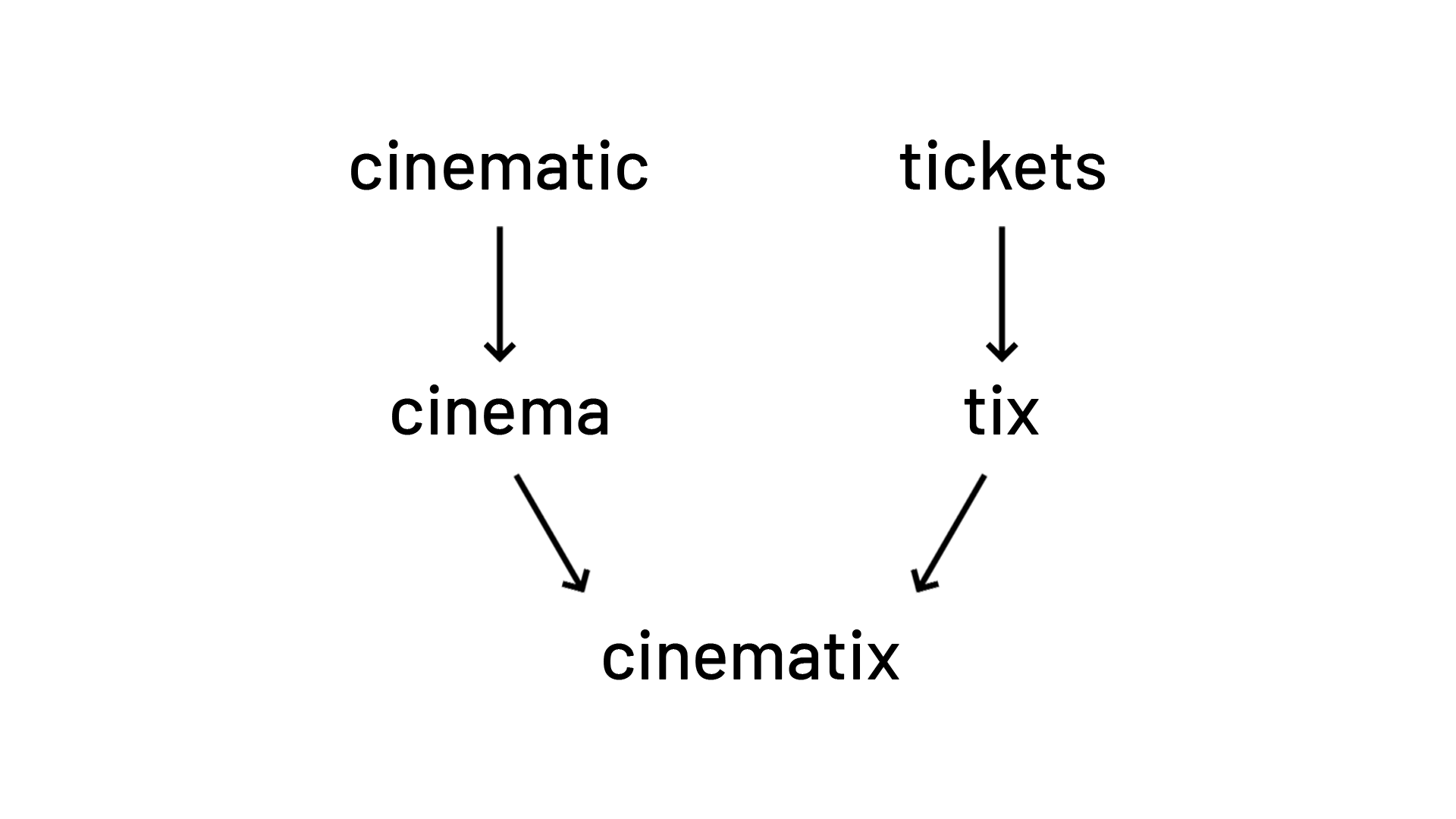
The name “Cinematix” combines the words “Cinema” and “Tickets” while simultaneously imitating the word “Cinematic” to create the brand that is perfect for a cinema ticketing mobile app.
Logo
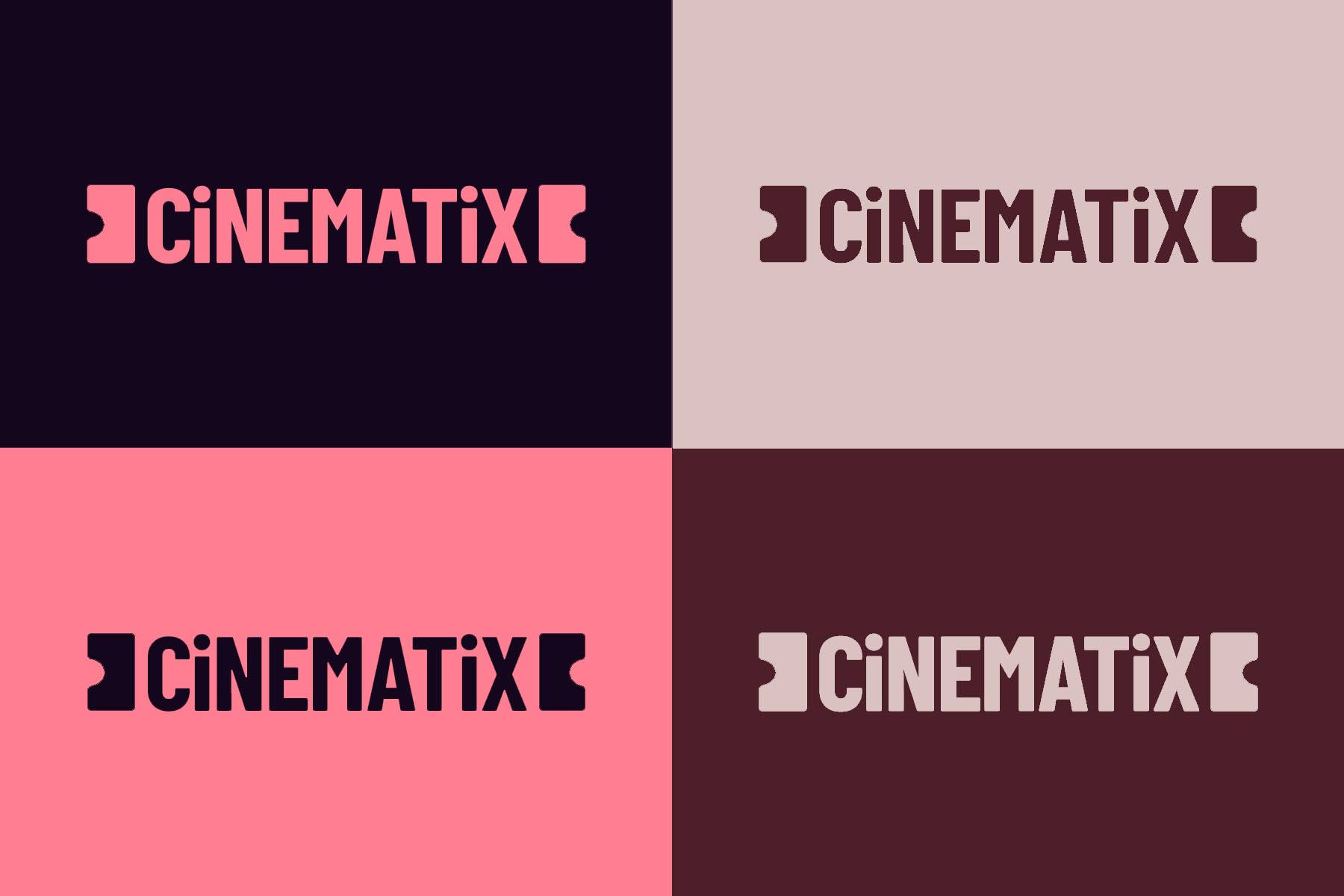
The logo for Cinematix was created with the idea of it illustrating a movie ticket. It is all capital letters except for the i’s to show symmetry and the emphasis on
Color
All 5 colors used in this project were carefully selected to imitate colors that may be found in a cinema or theater.

Refining the Design
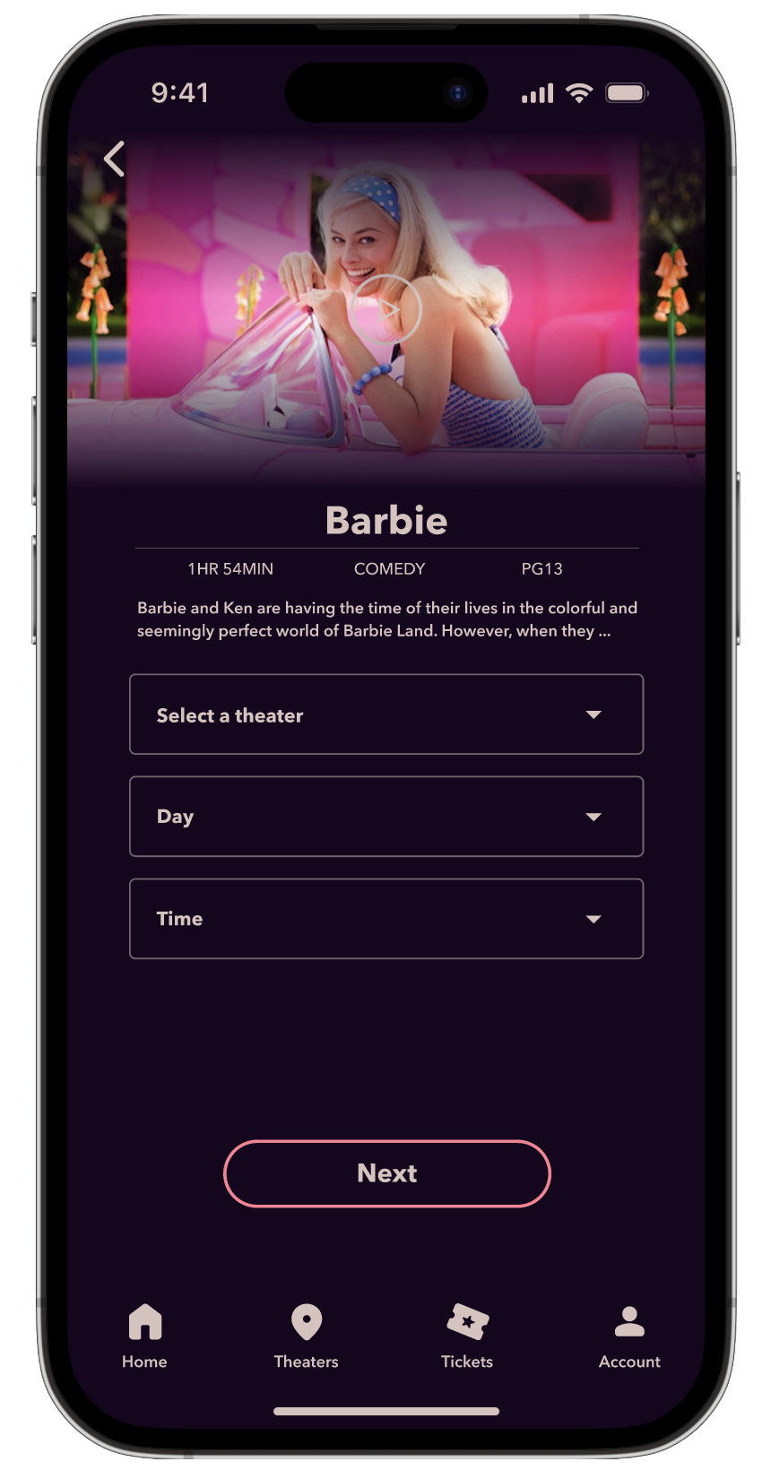
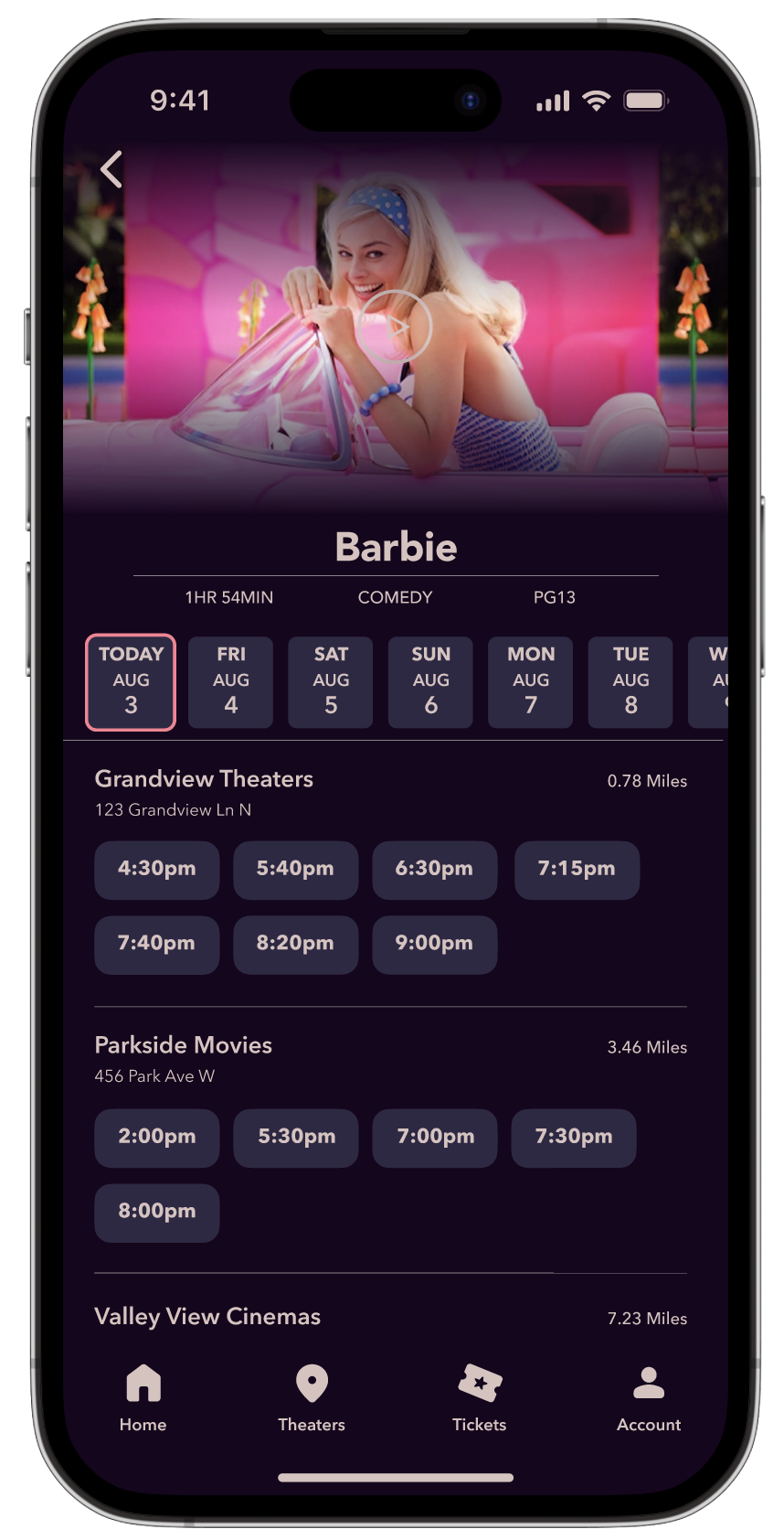
In user experience studies, given the option between these two screens, users unanimously chose the second option as it gave the user less tasks. The screen on the left required users to do a minimum of 7 taps to proceed to the next step, while the screen on the right only requires single tap.
Before
After
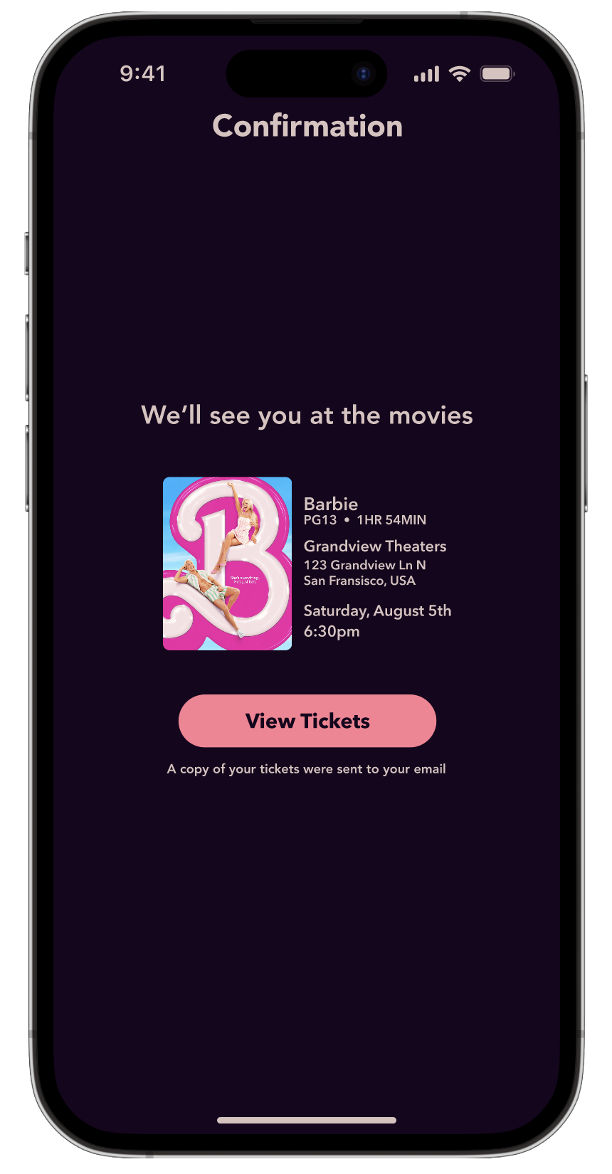
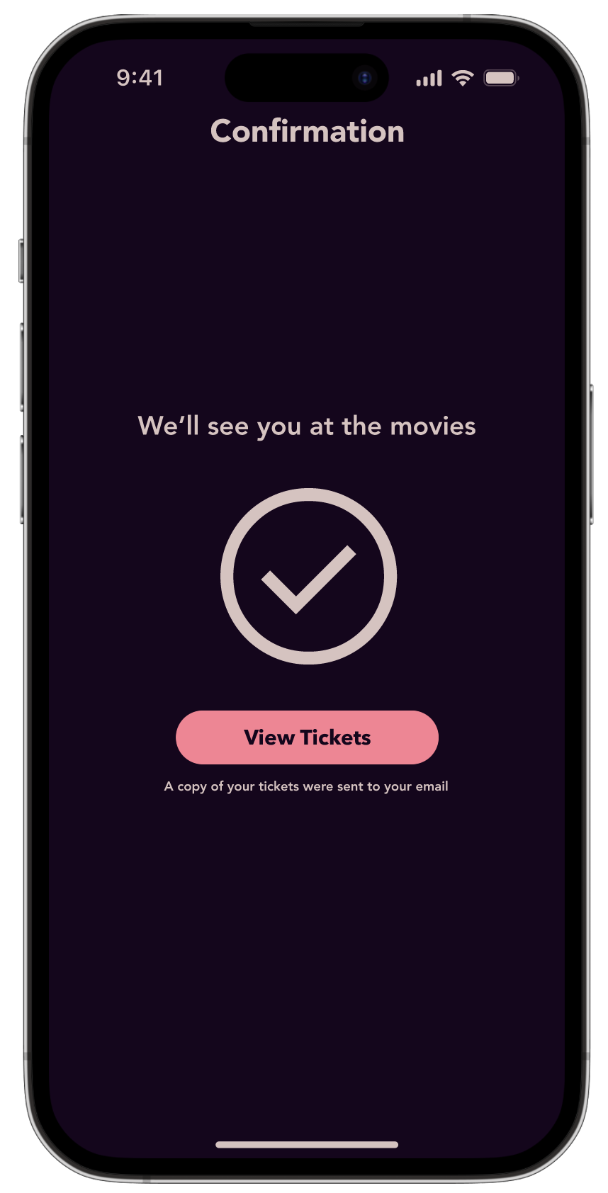
The information on the confirmation screen was found unnecessary as it already is shown on the checkout and ticket screen. To improve the enjoyability of the experience, the information was replaced with a check mark.
Before
After
Mockups
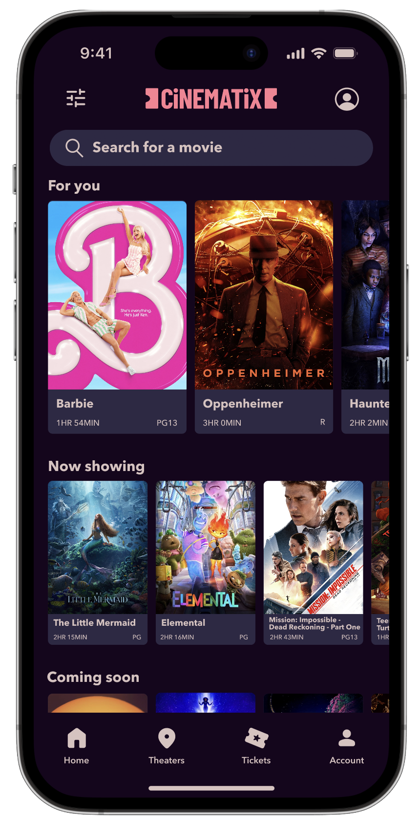

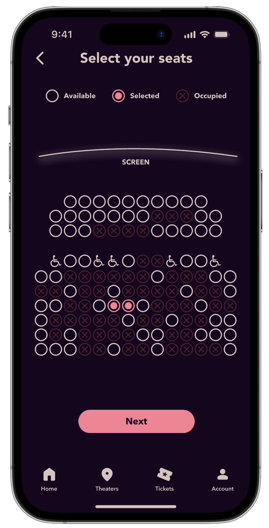
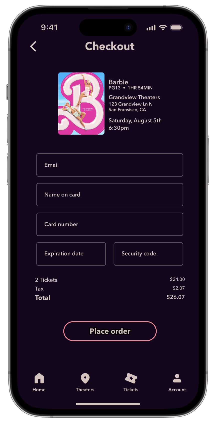
High-Fidelity Prototype
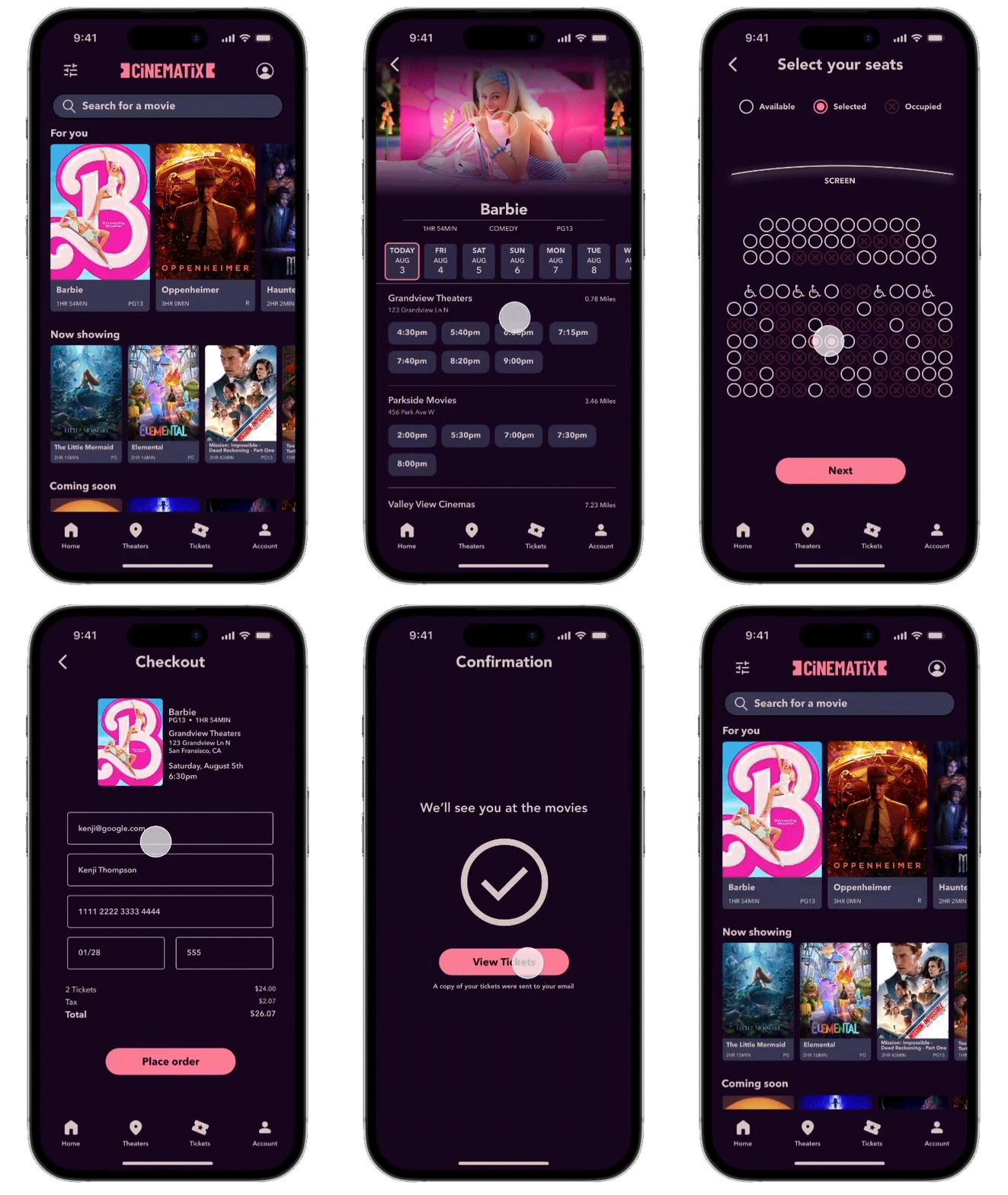
The high-fidelity prototype brings this app to life giving more insight into how the app will function when fully developed.
Accessibility Considerations
1
Added wheelchair accessible seating clearly labeled on the seat selection page
2
Used universal icons to make navigation easier
3
Provided access for users who are visually impaired through alt text on images for screen readers
Reflection
looking back
This project made me truly empathize with users, and not just make design decision based off my opinions and design taste.
Moving forward
With this being my first major user experience project I have done, I hope to improve in every aspect but especially in empathy of the user in order to create the most equitable designs possible.