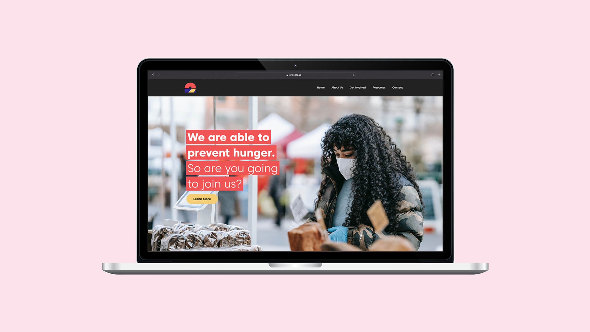
project2
A dream of accessible and supported food shelves
Overview
Challenge
Design and develop and comprehensive website and brand that communicates the need food shelves in the United States have for volunteers and supplies.
SOLUTION
Create a full design plan for the site by creating a logo and color scheme that is carefully selected, develop a creative brief, create a navigation, site architecture, and funnel plan. After this planning stage, begin designing wireframes and prototypes for the website. Lastly, develop the site with HTML, CSS, and PHP.
ROLE
Web Developer, Brand Strategist
TIME
8 weeks
TASK
Website and branding
Tools
Adobe Photoshop, Adobe Dreamweaver, Filezilla, Mailchimp, GoDaddy
Creative brief
Profile
project2 is a“non–profit helper”that seeks to give food shelves an outlet for their needs. The site that project2 will have will provide this outlet through an email list and resources listed on the site. If a food shelf is running low on supplies or volunteers, project2 can give it a boost and start a campaign. project2 will mainly focus on the impact of doing things together, because one person can only do so much, but together we can accomplish anything.
Marketing objective
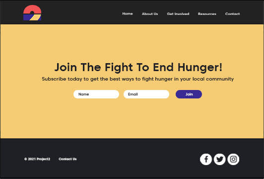
The site, as mentioned previously, will utilize an email subscription list to accomplish its goals. The email list will be used to notify people of local food shelf needs and opportunities. This could include but is not limited to volunteer needs, urgent donation needs, updated policies, and new food drives. This email subscription may have options regarding what alerts the user wants to be notified about. To maximize subscriptions the form will be on all pages of the site.
Target audience
This site’s primary target audience will be young people of any gender ages 13 through 28. Since food drives are mainly organized by adults, this will give young people an opportunity to take charge of making a positive change in their community themselves. While targeting the entire United States would be a long-term goal of the organization, project2 will mainly focus on the Midwest to not spread its resources too thin.
Marketing strategy
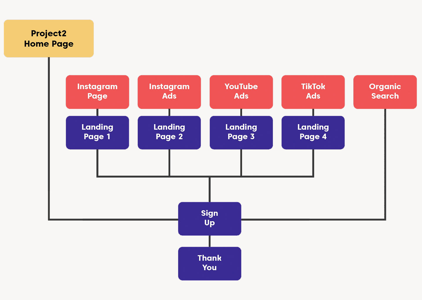
To attract this younger target audience to this brand, project2 will use multiple social media platforms that are most popular among young people. I collected the following top 5 most vital focuses for marketing project2’s website.
- Instagram page
- Instagram ads
- YouTube ads
- TikTok ads
- Organic search
Assets
All assets of the site will be free to use, as in their will be only images used with the Creative Commons license or they will be images from myself. Some images may be collected from third-party stock image platforms that offer free-to-use images. Graphics including the logo and separators for the site will be produced by myself.
project2 logo
Structure
Navigation
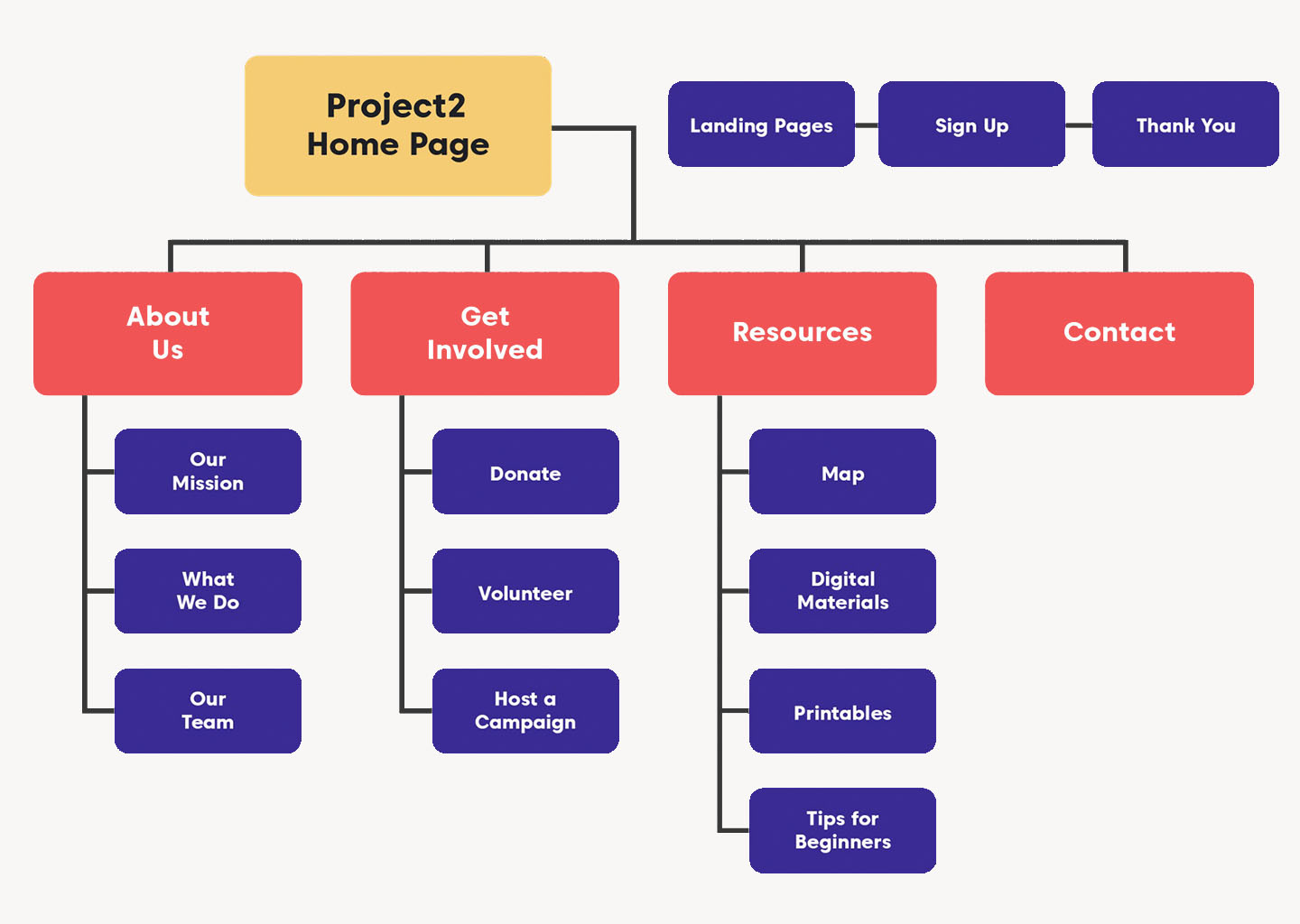
Architecture
/(root of project2 website)
- about-us/(folder)
- index.html
- our-mission.html
- what-we-do.html
- our-team.html
- contact.html
- css/(folder)
- get-involved/(folder)
- index.html
- donate.html
- volunteer.html
- host-a-campaign.html
- index.html
- images/(folder)
- landing-page.html
- resources/(folder)
- index.html
- map.html
- digital-materials.html
- printables.html
- tips-for-beginners.html
- sign-up.html
- thank-you.html
Funnel plan
Wireframes and prototypes
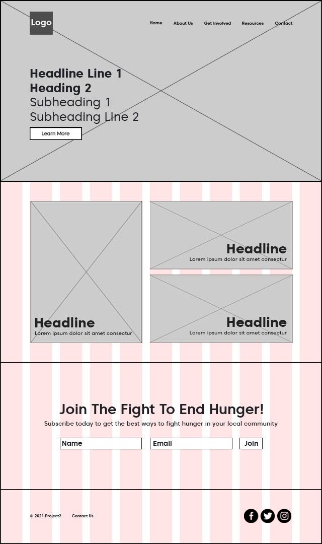
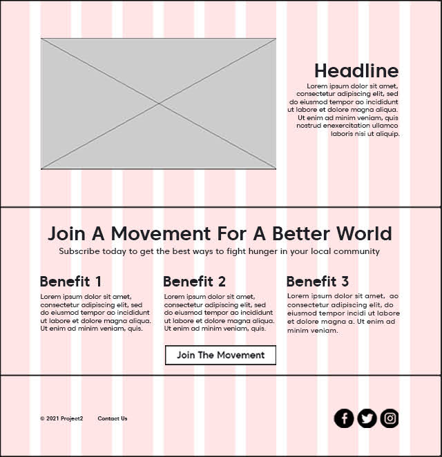
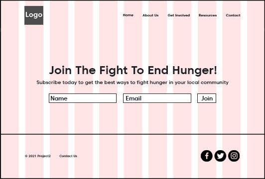
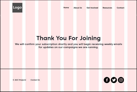
Low fidelity wireframes
Using Adobe Photoshop I made the following wireframes with a focus on a modern layout and appropriate spacing.
Prototypes
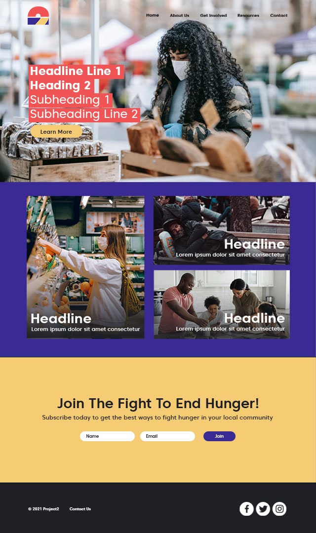
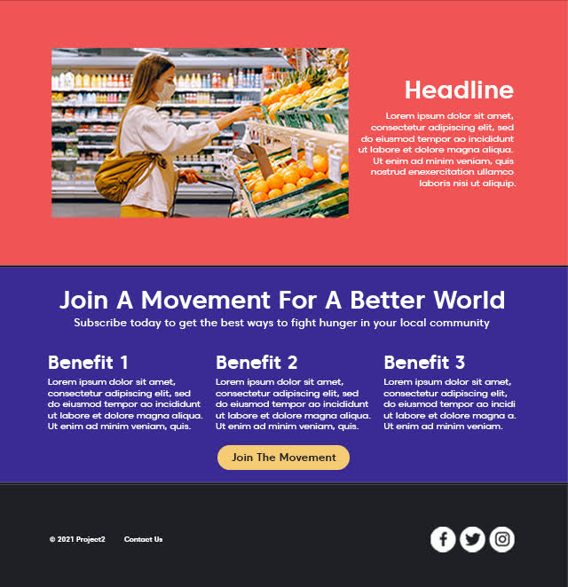
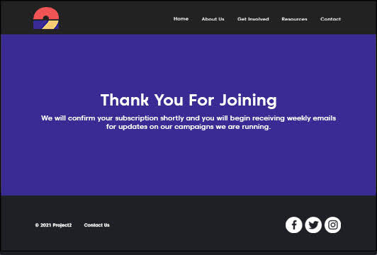
Also using Adobe Photoshop, I made these prototypes with a focus on using color in order to appeal to the younger target audience.
Reflection
looking back
This was my first project working with brand and web development, and overall I believe it was well done. From a UX designer’s standpoint, their are many areas of the website that I could have made more accessible; an example would be on the home page where I chose to have no navigation bar background solely for aesthetic reasons, but this may make it more difficult on certain devices to see some of the menu items. A bright color scheme was also used to attract a younger target audience, but no considerations were taken for those who may have impaired vision or color blindness. If I were to do this project again I would more carefully consider these when making decisions.
Moving forward
From this project I now have experience using HTML, CSS, and PHP to create a website. With these aquired skills, I am excited that I will better understand how to communicate to front end developers as a UX designer.
